~/work/iris-ifile-edge
IRIS iFILE Edge: a product site regulators can actually navigate
The iFILE Edge product site for capital-market regulators and stock exchanges: a dense, data-heavy story told so it reads like a supervision platform, not a brochure, with every enquiry routed straight into Zoho CRM.
- client
- IRIS RegTech Solutions
- year
- 2026
- duration
- —
- role
- Web developer, information architecture & UX (freelance)
regulators & exchanges
audience
4 steps
disclosure lifecycle explained
2
plans compared side by side
Zoho CRM
lead capture
Challenge
iFILE Edge is IRIS RegTech's ready-to-deploy supervision platform: capital-market authorities and stock exchanges use it to collect, validate, review and publish listed-company disclosures. The product page had to carry a lot: the regulatory case (IOSCO alignment, ISSB-ready sustainability reporting, machine-readable XBRL disclosure), the filing lifecycle, six capability modules, deployment options, two pricing plans with a long comparison, proof from live markets, FAQs and downloadable kits.
The people reading it are not a typical SaaS audience:
- Data-first, not tech-first. Supervisors, market-surveillance teams and exchange officials care about filings, deadlines and data quality. They do not want product jargon or clever interactions.
- A wide range of habits. Some readers are modern and skim; others are senior, old-school and read every line.
- High stakes, low patience for marketing. A page that looks like a brochure loses credibility with a regulator. The information has to feel like the platform: precise, structured and trustworthy.
So the brief was two problems at once: show a lot of information without overwhelming anyone, and make it easy to move around a long page without getting lost.
Approach
Information architecture before design
I started from the questions a regulator asks, in the order they ask them, and made that the page order:
- Why should a market modernise supervision? The global standard: machine-readable disclosure, IOSCO-aligned oversight, ISSB-ready sustainability, peers already live.
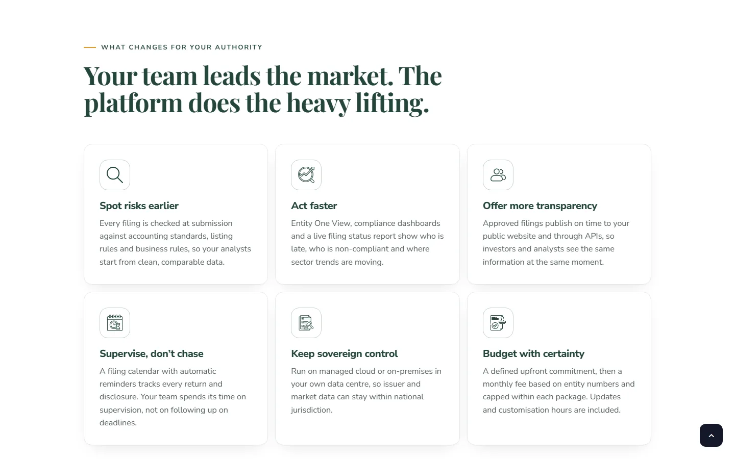
- What changes for my authority? Six outcomes (spot risks earlier, act faster, more transparency, supervise instead of chase, sovereign control, budget certainty), each one sentence of mechanism, not adjectives.
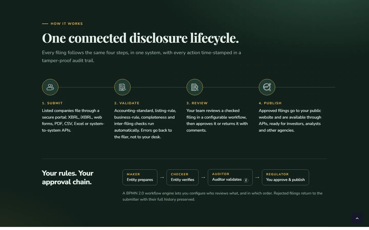
- How does it work? One connected disclosure lifecycle: submit, validate, review, publish, plus the maker → checker → auditor → regulator approval chain.
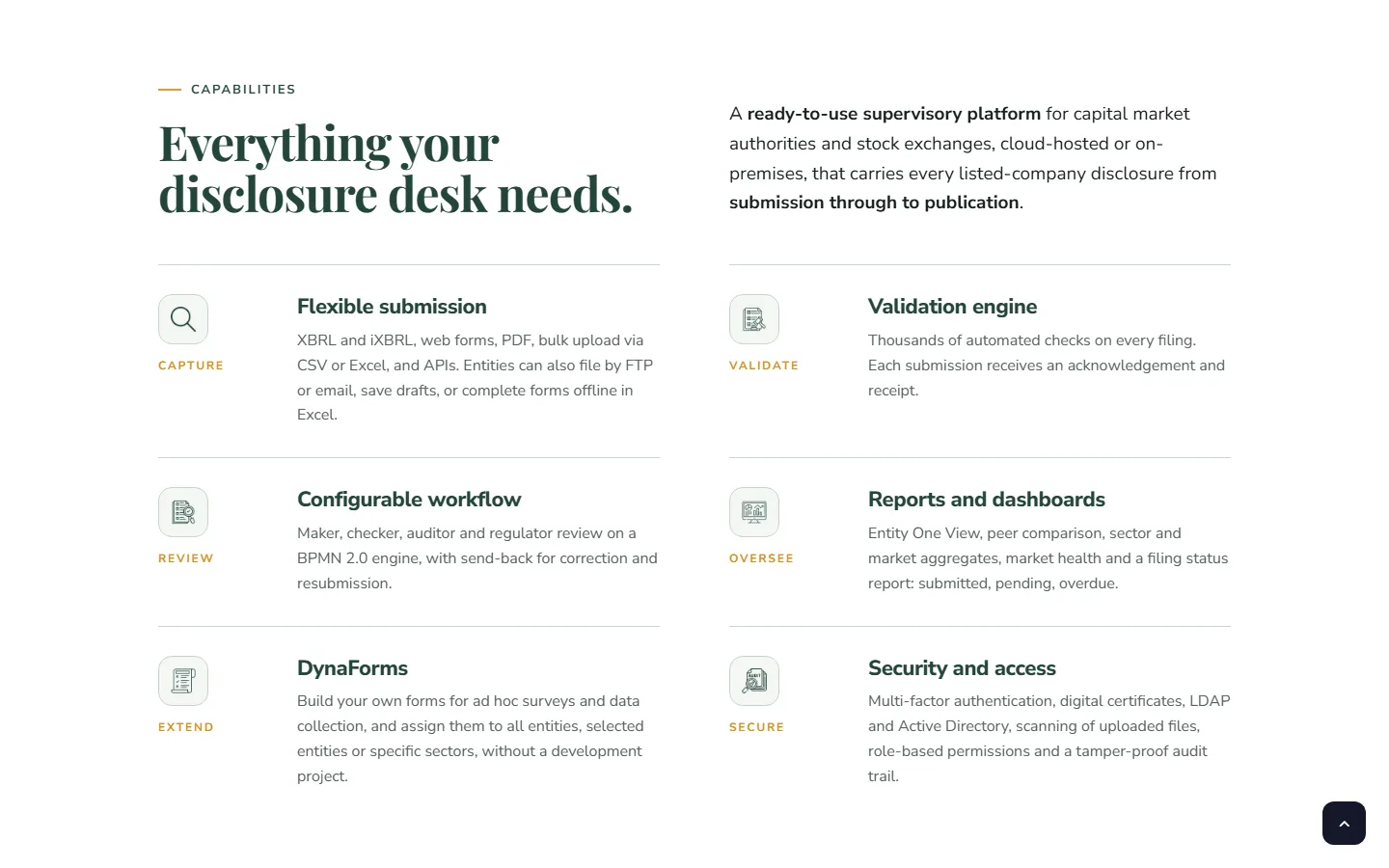
- What's inside? Capabilities grouped by job (capture, validate, review, oversee, extend, secure).
- What does it cost and what do I get? Two plans, then a row-by-row comparison, then what is included.
- Who else uses it? Proof from live markets (Tadawul XBRL e-filing, CMA Kuwait).
- What next? Talk to the experts, or download the kit and brochure.
Each section answers one question, so a reader who stops halfway still leaves with a complete picture of the parts they read.
Navigation for a long page
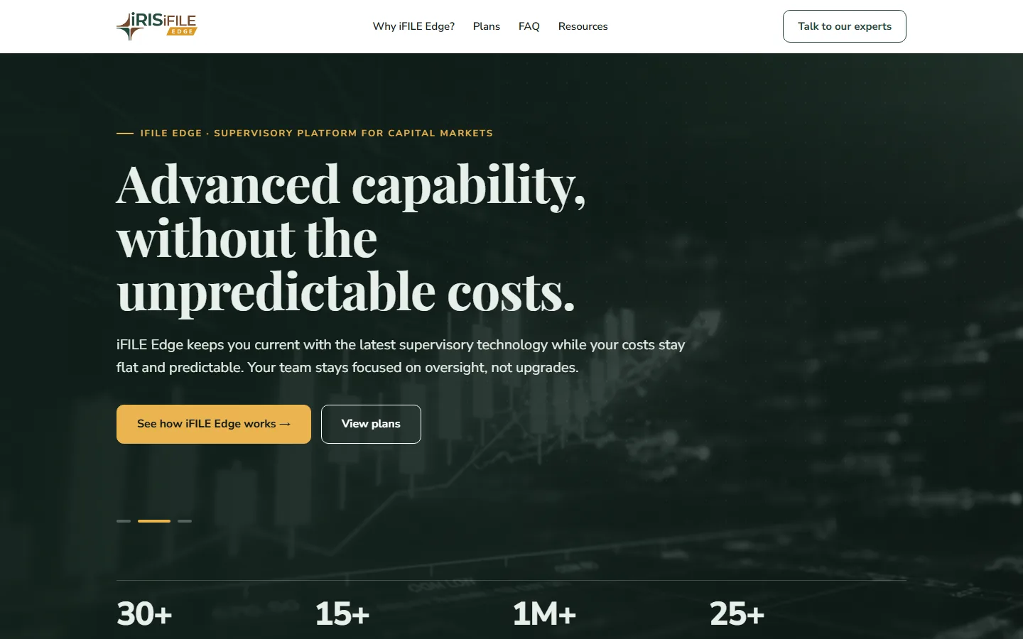
- A compact sticky header with four anchors that match the reader's questions: Why iFILE Edge?, Plans, FAQ, Resources, plus one persistent primary action, Talk to our experts.
- A back-to-top control for readers who go deep into the plan comparison.
- The same structure collapses cleanly on mobile: logo, anchors and the expert CTA stack instead of disappearing into a hamburger, because this audience does not hunt for hidden menus.

Dense, but not overwhelming
The rule was one idea per block, with numbers carrying the weight:
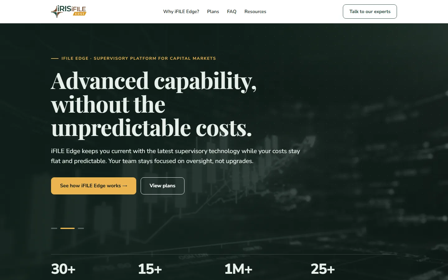
- Numbers up front. The hero closes on four scannable facts (30+ regulators and exchanges, 15+ countries, 1M+ entities filing through IRIS platforms, 25+ years in regulatory technology) instead of paragraphs of credentials.
- Cards with a verb-first title and one sentence of mechanism for the outcomes, so a skimmer reads only titles and a careful reader gets the "how".
- The lifecycle as a numbered sequence, with the approval chain shown as a flow of roles, because regulators think in workflows and sign-offs.
- Capabilities grouped by job, each with a short label (capture, validate, review, oversee, extend, secure) a reader can scan down the left edge.
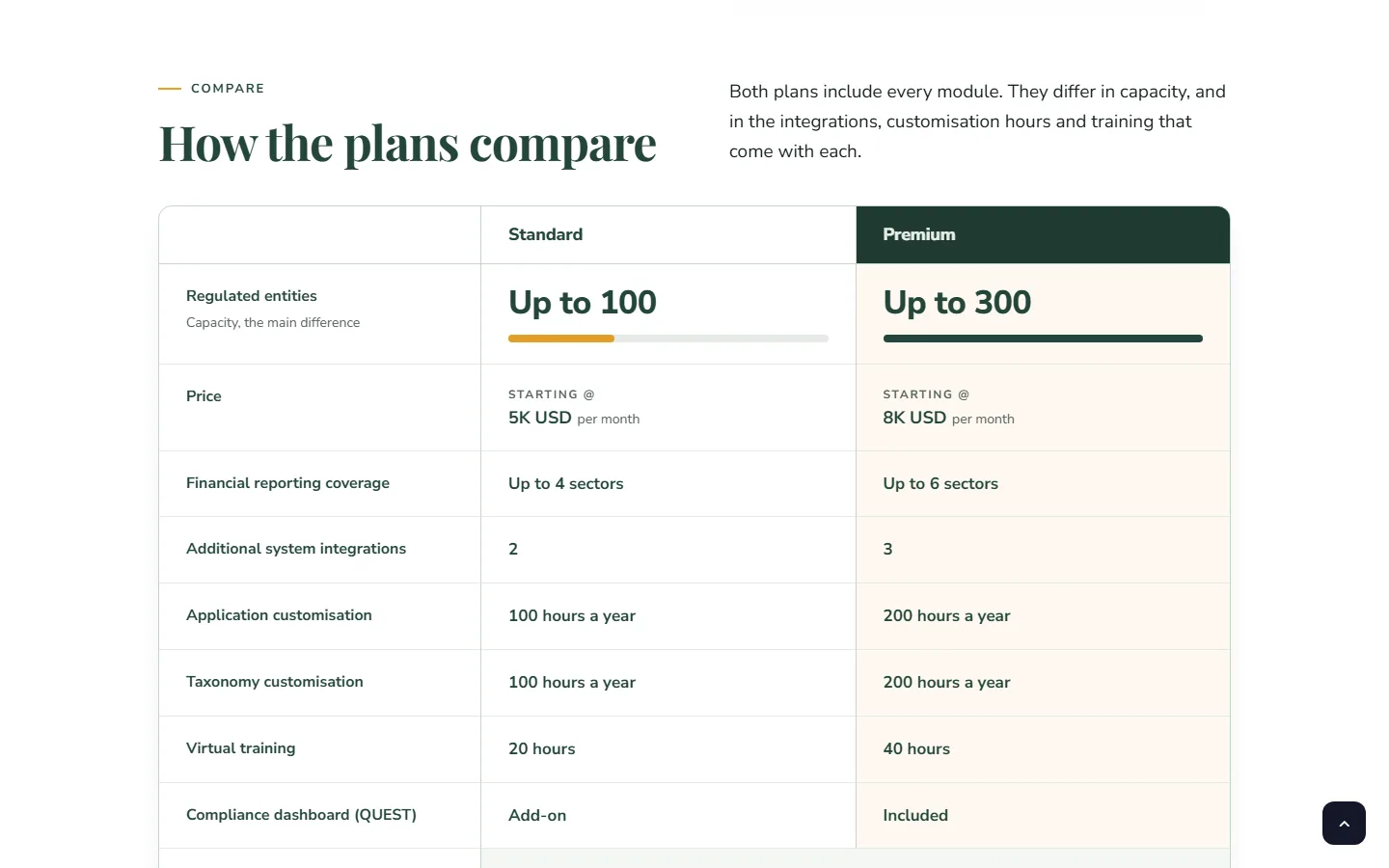
- Pricing as a real comparison table, not marketing tiers: capacity first (it is the main difference), then price, coverage, integrations, customisation hours, training and the compliance dashboard, row by row.
Not a brochure
The visual language stays close to a professional document: restrained colour, a serif display face for headings, generous white space, and real product vocabulary (XBRL, iXBRL, BPMN 2.0, maker-checker) used precisely rather than hidden. Modern readers get a clean, current interface; traditional readers get something that reads like a well-edited report.
Zoho CRM integration
Every conversion point (Talk to our experts, the iFILE Edge kit and brochure downloads) is a Zoho CRM web form embedded in WordPress, so enquiries land in IRIS's CRM as leads with their source attached, with no copy-pasting from inboxes. I styled the embedded forms to match the page and placed them where the reader's question naturally ends, rather than in a single "contact us" block at the bottom.
What shipped
- The iFILE Edge product page on the IRIS WordPress site, built with Elementor and ACF-driven content blocks so the marketing team can update copy, numbers and plan rows without a developer.
- A hero carousel with three positioning messages, each with its own call to action.
- Section-anchored navigation, sticky header, back-to-top, and a mobile layout that keeps every route visible.
- Zoho CRM web-to-lead forms for expert enquiries and gated resource downloads.
Results
The page is live at irisregtech.com/products/ifile-edge. It carries the full product story — regulatory case, lifecycle, capabilities, pricing, proof and resources — on one navigable page, and every enquiry and download goes straight into Zoho CRM as a lead.
What I'd do differently
Instrument it from day one: section-level scroll depth and anchor clicks would show which questions regulators actually jump to, and that should drive the order of the page more than any workshop.
More case studies
// need something similar?
Let's talk about your system.
A 15-minute call is enough to tell you whether I can help and roughly what it takes.